Design: JRP Design and Remodel
As a central space for gathering and conversation, the kitchen island is where daily schedules are discussed over morning coffee, after-school snacks and homework sessions are shared, and guests inevitably congregate during gatherings. Each of these scenes is illuminated by the pendants that hang above, lighting the way for lingering conversations and a place where guests naturally gather. More than a finishing touch, the right pendant lighting ties the kitchen's aesthetic together while delivering the clarity and warmth every task and every moment deserves.
With so many styles, finishes, sizes, and configurations to consider, choosing the right pendant lighting can feel like a lot to navigate. Whether you're deep into a renovation or just starting to gather ideas, consider this your guide for making confident, informed lighting decisions.
Curated Pendant Styles for 2026
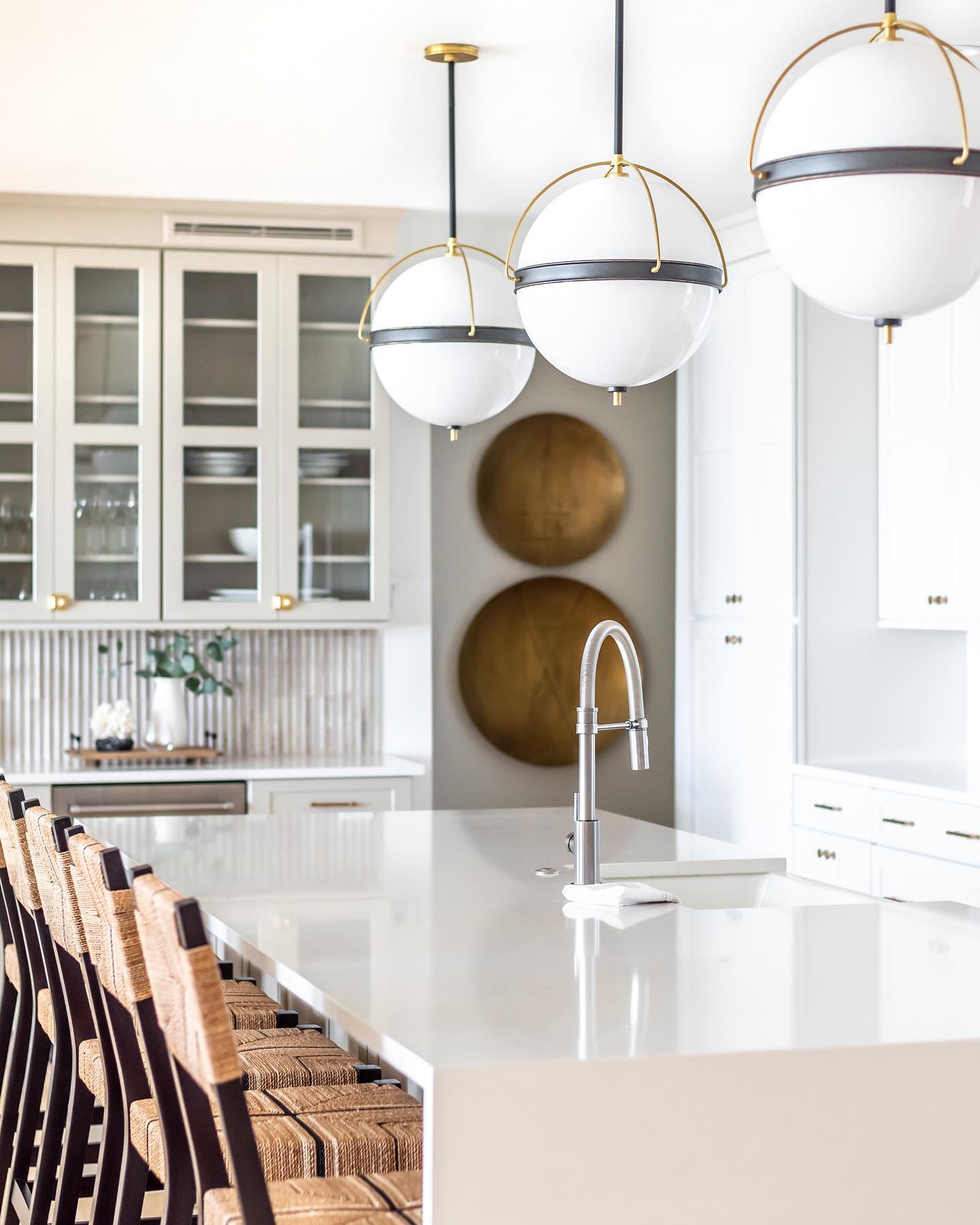
Designer: catherinewilsoninteriors
Photo: mali_azima
Your home is your canvas for personal style, and kitchen pendant lighting is the perfect area for expression. In 2026, the decorative pendants drawing the most attention fall into a few clear visual languages, each with its own personality.
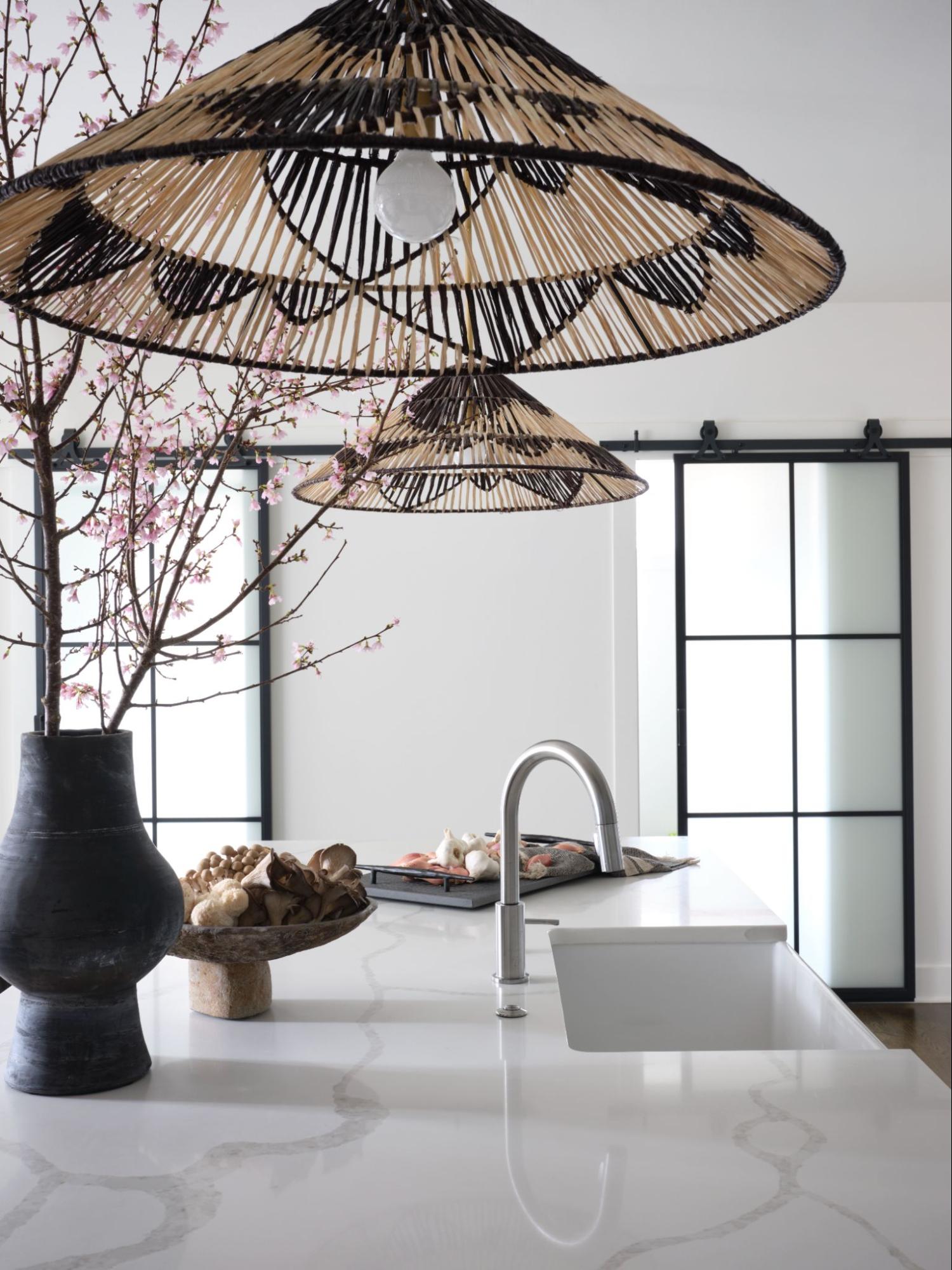
Organic Modern: Woven Textures & Natural Materials
Rattan, seagrass, hand-thrown ceramic, and whitewashed wood—organic modern continues as a dominant aesthetic in the kitchen. Fixtures crafted from these natural materials bring warmth and texture into kitchens that might otherwise read as too sleek or austere. A woven rattan bell pendant over a waterfall-edge island softens the stone without competing. Ceramic pendants in earthy tones like sage, terracotta, and warm white add sculptural weight without the visual heaviness of metal. What makes organic modern feel current rather than rustic is restraint: clean silhouettes, neutral palettes, and a commitment to quality materials.
Sculptural Artistry: Glass & Mixed Media
For a jewelry-like statement, glass pendants - especially those in blown, ribbed, or seeded varieties - deliver transparency, luminosity, and undeniable craftsmanship. Amber and cognac tones are having a particularly strong showing in 2026, casting a warm, flattering glow that enhances both the table and the people gathered around it. Smoke-tinted glass feels more directional and architectural, pairing well with darker cabinetry and matte black or unlacquered brass hardware.
Mixed-media fixtures that combine glass with metal cages, leather-wrapped cords, or ceramic bases bring an added layer of intentionality. These are the pendants people comment on at dinner parties. The key is ensuring the artistry feels curated, not cluttered—a single material should anchor the piece, with the secondary element serving as an accent.
The Linear Statement: Sleek Profiles for Contemporary Spaces
Linear pendants, long, low-slung fixtures that run parallel to the island, have become the go-to solution for kitchens where a row of individual pendants would feel visually out of balance. A single linear fixture spanning most of the island's length provides cohesive illumination and a strong architectural line that visually elongates the space.
This year, linear pendants are appearing in everything from minimalist rod forms with exposed Edison-style bulbs to more elaborate sculptural bars with integrated downlights and decorative shades. For a kitchen with strong horizontal lines (long runs of cabinetry, an extended island, large-format tile), a linear chandelier, such as our Raphael Linear Chandelier, reinforces that geometry rather than interrupting it.
Asymmetry & Clusters: Breaking the "Row of Three" Rule
While a row of three matching pendants brings visual symmetry and calm to the kitchen, the most interesting kitchens right now are moving beyond this common configuration. Clusters of pendants hung at varying heights, mixing two or three related (but not identical) fixtures, or choosing a single piece in an asymmetrical form can add interest and intrigue to a space.
Asymmetric arrangements work best when there's an underlying logic: shared finish, material family, or visual weight. Mixing a ceramic pendant with a glass one in the same tonal family, for example, feels intentional rather than indecisive. This approach works especially well over larger islands or kitchen tables, where strict symmetry can feel overly formal.
Mastering Proportion: A Guide to Sizing & Scale
Design: tracylynnstudio
Photo: @ryangarvin
Even the most beautiful pendant can underperform if scaled incorrectly. Proportion is perhaps the single most important variable in pendant selection. Fortunately, there are reliable principles that take much of the guesswork out of it.
Balancing Fixture Volume with Island Dimensions
A common rule of thumb: the combined width of your pendants (including the visual negative space between them) should occupy roughly half to two-thirds of the island's length. For a 7-foot island, that could mean three 8-inch pendants spaced 24 inches apart, or two 12-inch pendants with generous breathing room between them.
Diameter matters, but so does height. Tall drum pendants or elongated forms add vertical presence that feels dramatic in rooms with high ceilings but overwhelming in standard 9-foot spaces. When in doubt, choose a fixture with a larger diameter and lower profile rather than a narrow, tall one, as wider fixtures tend to anchor the space more gracefully.
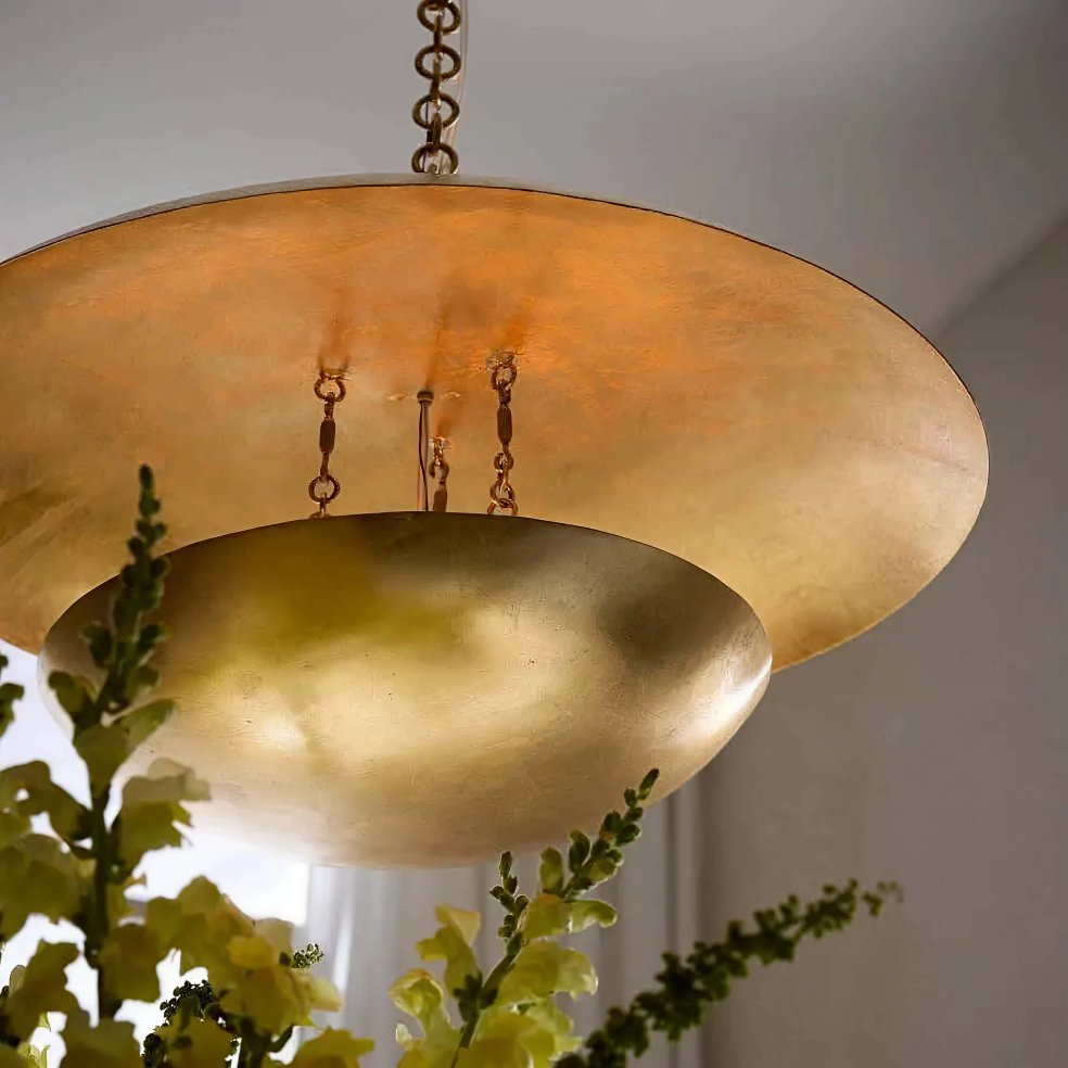
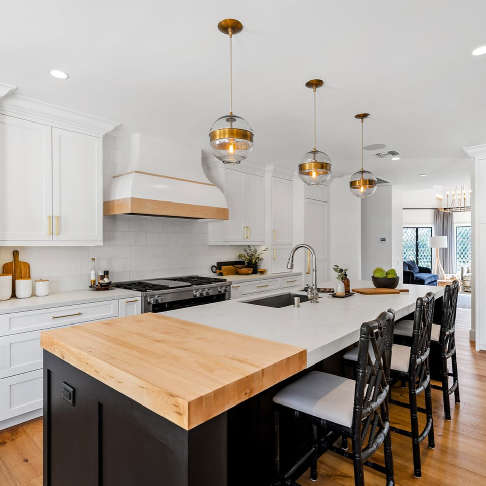
The Rule of Three vs. The Power of One
Three pendants over an island is the classic formula, and for good reason: it distributes light evenly, creates visual rhythm, and feels balanced without being static. Oversized single pendants (particularly in the 18 to 24 inch range) make a compelling case for the solo statement, especially over narrower islands or as a deliberate focal point in a more minimal kitchen. Choosing just one pendant also allows you to incorporate striking forms or dramatic materials, which could overwhelm the space if used in multiples.
Height & Clearance: Optimizing Visual Comfort
The industry standard for pendant height over a kitchen island is 30 to 36 inches from the bottom of the fixture to the countertop. This range keeps the light source low enough to be effective and intimate, while maintaining clear sightlines across the island. For islands with seating, the lower end of that range (closer to 30 inches) works better, ensuring guests do not look directly into an exposed bulb.
Ceiling height is the guiding factor. In rooms with ceilings higher than 9 feet, you can - and often should - hang pendants slightly lower to maintain visual connection with the island. In rooms with 8-foot ceilings, be especially mindful of total fixture height—a tall drum pendant may leave insufficient clearance, creating a cramped feeling and obstructed sightlines even if the diameter is appropriate.
Materiality & Finish: Creating a Cohesive Palette
Design: apressuninteriors
Finish selection is where pendant lighting connects to the rest of the kitchen's material story. A pendant that looks stunning in isolation can feel off, especially if the material or finish doesn't speak to the hardware, cabinetry, countertops, or backsplash in the room.
Mixed Metals: Integrating Brass, Bronze, & Nickel
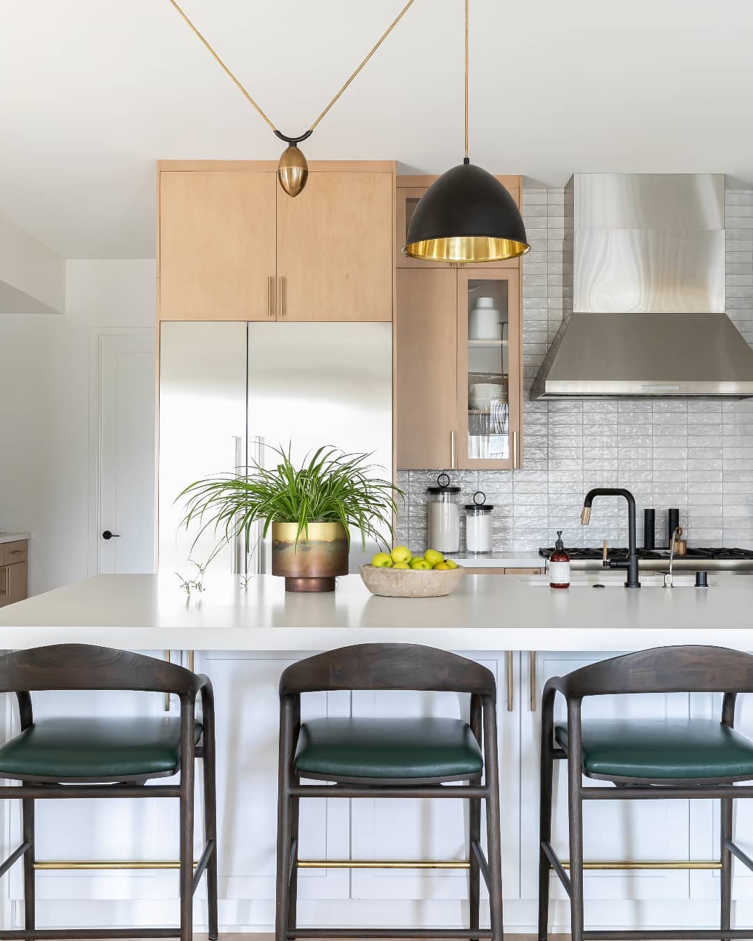
Perfectly matching faucets, cabinet pulls, and lighting hardware is no longer essential to a cohesive space. When done thoughtfully, mixing metals creates depth and sophistication that a monochromatic approach can't achieve. The most successful combinations involve one dominant metal (for example, brushed nickel on the faucet and drawer knobs) and one accent (unlacquered brass on the pendants and light switch plates). Keeping the dominant metal more neutral allows the accent to feel intentional rather than mismatched.
Aged bronze and warm brass are natural companions, sharing a warm undertone that reads as cohesive. Matte black works as a strong counterpoint to nearly any warm metal and adds graphic definition. Use caution when pairing cool-toned chrome or polished nickel with a warm brass accent, as the temperature contrast can feel disjointed unless balanced by warm wood tones or natural stone.
Transparency vs. Opacity: Controlling Light Output
A pendant’s shade material determines where light is directed and the overall mood it creates. Clear glass pendants distribute light broadly, illuminating the countertop below while also casting ambient light into the surrounding space. Frosted or seeded glass softens and diffuses, reducing glare while maintaining a warm glow. Opaque shades in ceramic, metal, or fabric concentrate light downward, creating a dramatic pool of illumination with less ambient spill.
For a working kitchen where task lighting is paramount, some degree of transparency or downward-directed light is important. For a kitchen where atmosphere matters as much as function—think open-plan spaces that double as entertaining areas—the softer glow of frosted or translucent shades often serves the room better through the full arc of a day.
Warmth & Atmosphere: Bulb Temperature & Dimmers
Color temperature is one of the most underestimated decisions in kitchen lighting. For pendants over an island, a color temperature of 2700K to 3000K is ideal—warm enough to make food look appetizing, and people look their best, cool enough to support clear task visibility. Avoid anything above 3500K in a residential kitchen; the light can start to feel clinical and flatten the visual quality of both surfaces and food.
Just as the temperature and brightness of natural light change throughout the day, so should the light emanating from your pendants. Pairing your pendants with a quality dimmer, you can soften the light during dinner, increase the light when entertaining guests, or find a gentle mid-setting for slow afternoons. Not all LED bulbs are compatible with all dimmers, so confirm compatibility before purchase.
Layering the Light: Function Meets Ambience
A single fixture can anchor a kitchen, but it's the interplay of multiple light sources that brings the space to life. A layered lighting scheme, one that pairs a statement chandelier or cluster of pendants over the island with sconces flanking a window or range hood, gives you the flexibility to be creative and shift the mood throughout the day. Our range of chandeliers, pendants, and sconces makes it easy to build a cohesive scheme without sacrificing variety.
Managing Shadows and Glare on Surfaces
Before finalizing your fixture selections, consider how light interacts with your countertops and cabinetry. High-gloss surfaces like polished marble, lacquered cabinets, and stainless steel can reflect exposed bulbs directly into the eye line of someone seated at the island. Pendants with glass, natural fabric shades, or opaque downward-facing shades help diffuse that effect while still delivering focused light. On the other hand, honed and matte surfaces absorb light and benefit from more directional sources that accentuate texture and depth.
Smart Lighting Integration for Modern Living
Integrating a smart lighting system is one of the simplest ways to make a kitchen feel effortlessly responsive to how you actually live in it. If building or renovating, routing all fixture circuits through smart dimmer switches from the outset is far easier than retrofitting later. For existing installations, smart bulbs offer a less invasive upgrade path, though they require fixtures without built-in dimmers to function correctly.
FAQs About Kitchen Island Pendant Lighting Ideas
What Is the Golden Rule for Pendant Lighting Spacing?
For a row of three pendants, space each fixture 24 to 30 inches apart from center to center, and position the outer pendants roughly 12 to 15 inches from the ends of the island. For two pendants, hang each one approximately one-third of the island's total length from its respective end. Always measure from the canopy center point rather than the edge of the shade, as shade diameter varies significantly and can throw off your spacing calculations.
Are Oversized Pendants Over Kitchen Islands on Trend for 2026?
Yes, and with good reason. A single oversized pendant (something in the 18 to 38-inch range) or a large linear fixture makes a more decisive statement than a row of smaller fixtures and often reads as more sophisticated in a contemporary or transitional kitchen. The key is ensuring the ceiling height can accommodate the fixture's presence without making the room feel crowded.
How Do I Choose the Right Pendant Size for a Small Island?
Smaller islands benefit from restraint in diameter but can handle more visual interest in shape and material. A single well-chosen pendant centered over a compact island often reads better than two cramped together. Resist the urge to go too small as a default; an overly delicate fixture over a solid stone island can feel misplaced.